Projects
RippleForge
Live at rippleforge.gg · Try the demo
Log one event and every connected character, faction, and place feels it. RippleForge is a causality engine for narrative: a relationship graph in which an event propagates to allies, inverts for rivals, and compounds across sessions. It was built for tabletop game masters, and it works for any story in which what happens to one person matters to everyone else.
The AI is a referee, not a storyteller. It does not invent the world. It reads what a person has recorded, works out who is affected and in which direction, and proposes consequences for that person to accept or reject.
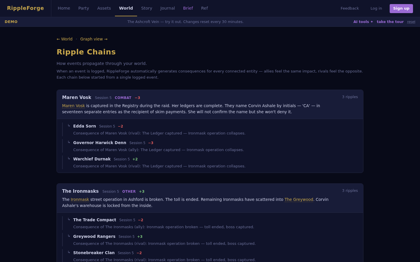
The pipeline. Raw session notes go in. A first model pass extracts discrete events, matches each to known entities, and assigns polarity and intensity. A second pass checks the result for consistency against the existing world. A person reviews the proposals and commits them explicitly. Nothing reaches the world state without that last step.
The chat co-pilot. A game master can correct a drafted proposal in conversation instead of editing fields by hand. It is a tool-use agent loop written directly against the Anthropic API, with no orchestration framework. The design constraint is that no tool may write to campaign data. Only the existing human-gated commit route can. A test asserts that a world file is byte-for-byte identical before and after a chat exchange, so the constraint is enforced rather than promised.
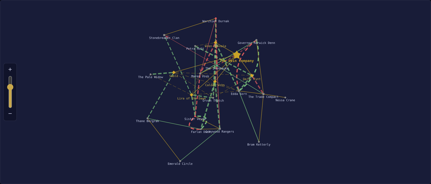
Time travel and forking. The world graph can be rewound to any session. A fork creates an alternate branch from that point, and the original timeline stays intact, so a what-if costs nothing.
How it is kept honest. The suite has 81 tests, all passing. The chat agent also has a staging gate: the current configuration is run repeatedly against a recorded baseline, and the result is PASS or BLOCK before a change ships. Results post to ai_glue, which shows agent health as RED, AMBER, GREEN, or UNTESTED. Every model call from the production app routes through ai_glue, so cost, latency, and errors are logged per call.
The public demo is a five-session frontier mining campaign called The Ashcroft Vein. Changes made there reset every 30 minutes.
Stack: Python, Flask, gunicorn, nginx, Cytoscape.js, Anthropic API (Claude Haiku), pytest. Billing is built and switched off.
ai_glue
Every call an application makes to a language model has a cost, a latency, and a payload. Most teams cannot say what those add up to, which projects spend the money, or whether a prompt just carried a Social Security number to a third party. ai_glue answers those questions by sitting between the application and the model provider.
It is a governance and observability layer for the Anthropic and OpenAI APIs. In proxy mode an existing application changes one environment variable, the base URL, and nothing else. Every call is then logged with provider, model, token counts, cost, latency, project, and session. In wrapper mode a new application calls a drop-in client instead of the provider SDK.
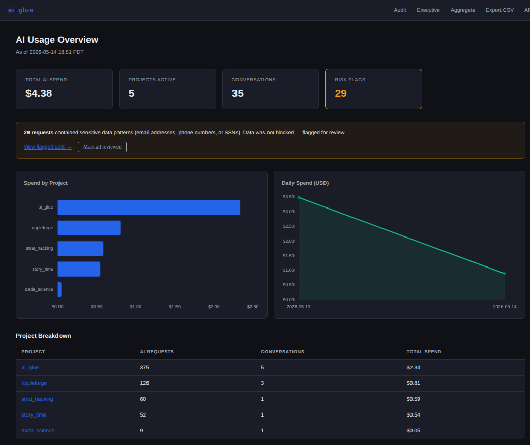
The executive view, from a May 2026 snapshot early in its life.
Policy, not just logging. Rules live in a YAML file that is reloaded on every request, so a change takes effect without a restart. An unapproved model is blocked before the call leaves. Daily cost caps and hourly rate limits apply per project. Email addresses, phone numbers, and Social Security numbers are flagged for review rather than silently passed. Teams can be issued their own keys, which map to a project and cost cap with no code change on their side.
One view across machines. Four instances run on my own hardware and servers: two on a Raspberry Pi, one on the production host for RippleForge, and one on a desktop. A parent instance merges them into a single audit view, an executive spend summary, and a per-instance breakdown. It is used on my own Claude Code traffic as well as on a production application, which is where two real bugs turned up: an aggregator that listed itself as a child and called itself in a loop, and a price table that logged several current models at zero cost.
Agent health. The newest piece answers a harder question than cost: is an agent still behaving the way it did when it passed its tests? Callers label each request with the agent that made it and the agent that called it. From those labels ai_glue builds a tree of agents and subagents and marks each one RED, AMBER, GREEN, or UNTESTED. The rules are plain. A blocked gate run or an error rate above 5 percent over seven days is RED. An agent running a configuration with no passing baseline, or whose production tool-call mix has drifted from the one it was tested on, is AMBER. The drift measure is total variation distance, with a threshold of 0.30 and at least 30 calls on each side. All of the status logic is pure functions with one unit test per rule.
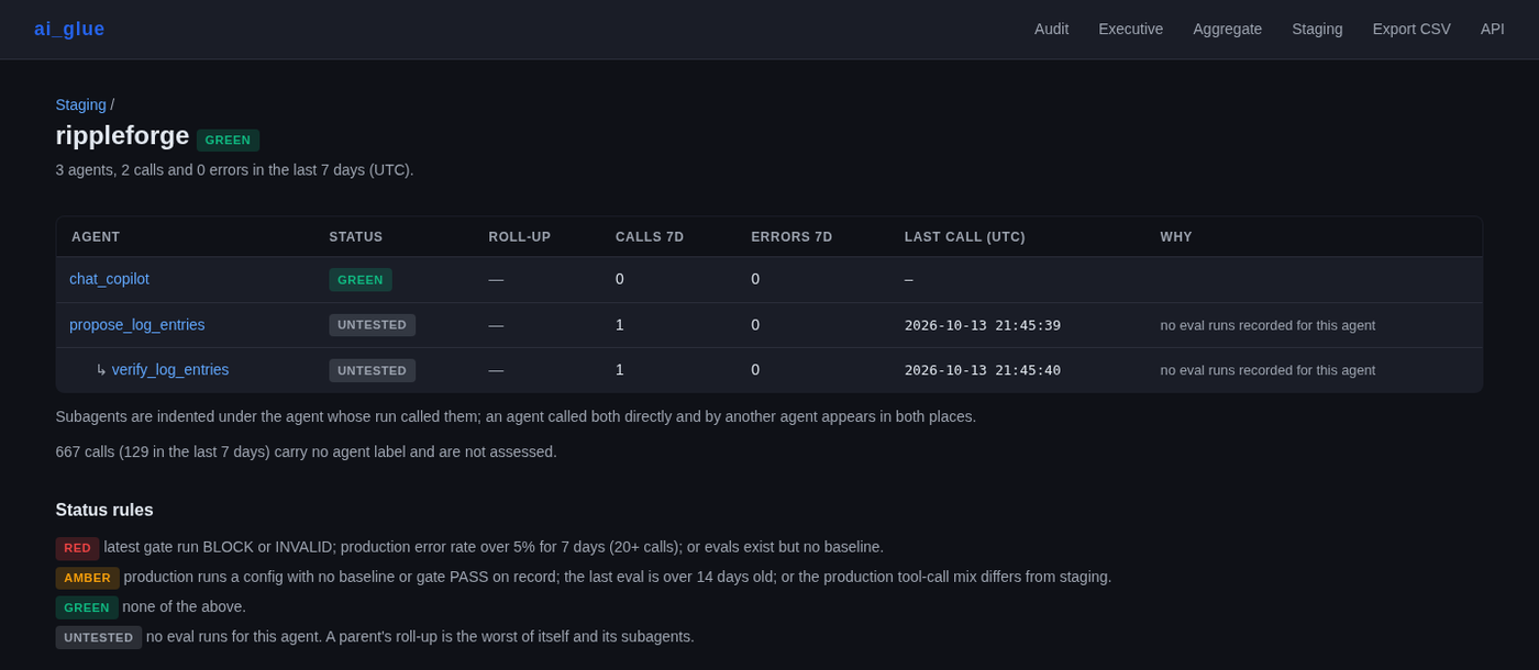
The page above is real and not flattering. Most of those agents read UNTESTED, because no eval run has been recorded for them yet. The tool reports that plainly instead of rounding up.
What it is not. It has no opinion about prompts, agents, retrieval, or orchestration. It does not replace an AI stack. Its job is to make the stack visible and to enforce a few rules.
Limits worth knowing. Individual user tracking is a deliberate non-feature, because it would require changes on the client and defeat the one-variable pitch. The dashboard can be placed behind a shared token, and raw prompt storage can be turned off, which is how the production instance runs. PII detection is pattern-based, so it catches formatted identifiers and misses anything a regular expression cannot see.
The suite has 120 tests, all passing, and none of them need an API key.
Stack: Python, Flask, SQLite, gunicorn, Anthropic SDK, OpenAI SDK, Chart.js.
Merascope
Merascope scores every ZIP code tabulation area in 48 states on 23 indicators of capacity and constraint, so that a siting decision can be argued from evidence instead of from the single variable that happened to be cheapest. It is the successor to the Washington data center analysis, rebuilt to cover 48 states instead of one.
The same inventory is reweighted for different purposes. A data center cares about transmission and water. A battery storage project cares about different things. Two hard gates disqualify a site regardless of weights, so a preference cannot talk its way past a physical or legal limit.
Three kinds of user work on the same records with different permissions. Builders screen sites. Stewards, the lead regulatory agencies, run a docket, a case file, and a conditions negotiation, and can export the evidentiary record. Co-parties such as tribes, counties, and utilities see a filtered docket and propose conditions. Access rules are written into the schema as constraints instead of left to convention, and every action is recorded in an append-only event log.
I am the only engineer. The backend is PostgreSQL 16 behind Flask and gunicorn, with a pytest suite that runs in GitHub Actions against a live Postgres container before anything deploys. Documents are served as short-lived presigned URLs from S3-compatible object storage.
Stack: Python, Flask, PostgreSQL, geopandas, boto3, GitHub Actions.
sf_majick
I wanted a model of a sales organization that had reps in it.
Not a conversion funnel — those exist — but something with agents who make decisions, develop opinions about their accounts, get burned out, and respond to organizational structure. The interesting question isn’t what the average conversion rate is; it’s what conditions produce a particular distribution of outcomes, and what levers actually move it.
sf_majick is a fully parameterized agent-based simulator for B2B sales orgs. Four rep archetypes — Closer, Nurturer, Grinder, Scattered — each with distinct personality traits governing action affinity, distraction rates, and burnout thresholds. Nine micro-actions (email, call, meeting, proposal, internal prep, and four others) carry attention cost and sentiment effects; macro transitions (lead conversion, stage advancement, close/lost) fire stochastically with probabilities modulated by sentiment, momentum, and rep behavior. Reps accumulate workload stress via an end-of-day burnout model; stress above archetype threshold craters available attention and increments days burned out. Every entity carries a sentiment state that decays under neglect and updates with each interaction.
The structural variable of most interest is the requirement gate: whether a micro-action must be completed before a stage can advance (AND logic), or whether completing any one of several qualifies (OR logic). AND-gate configurations produce low stage-advance rates and concentrated drop-off; OR-gate configurations produce higher throughput with a different distribution of deal stall. The figure below shows the funnel shapes each produces.
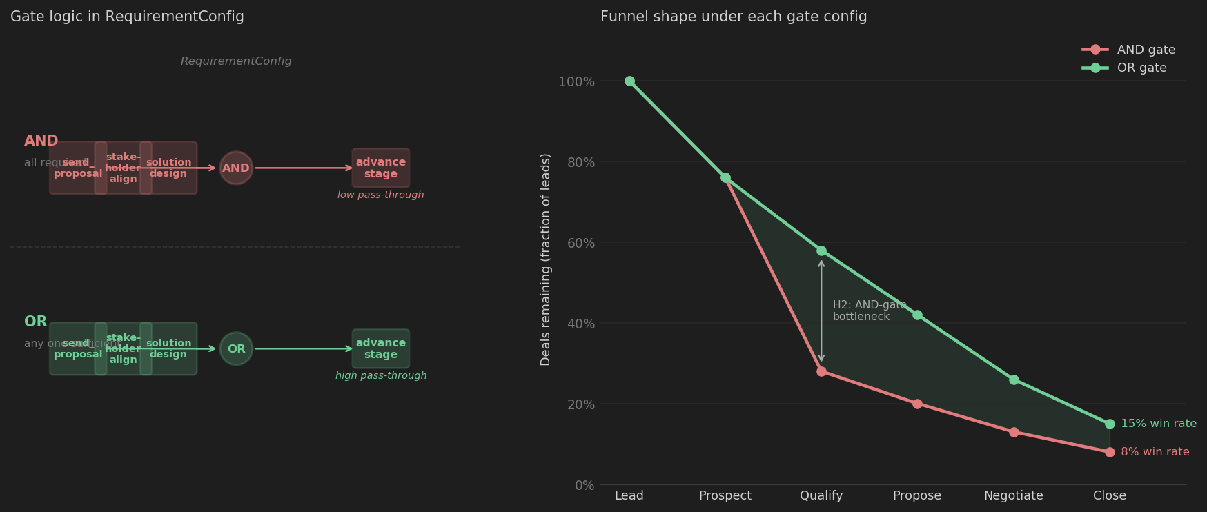
The calibration layer (OrgCalibrator) back-fits simulation parameters to a Salesforce SOQL export: win rate, cycle time, and stage distribution determine the probability fields; revenue distributions are fitted from deal-size data. The result is an OrgConfig whose simulated org behaviorally matches the real one. Experiments run against this baseline using ExperimentRunner — N Monte Carlo iterations per scenario, with OLS-adjusted action effect coefficients that control for stage, rep, and outcome before attributing sentiment deltas to specific micro-actions. This separates actions that move deals from actions that merely correlate with deals that were going to move anyway.
The web interface runs on a Raspberry Pi: a five-tab Flask app for org configuration, calibration diagnostics, and a Salesforce CSV drop that auto-fits and saves a calibration file. Simulation runs execute locally; the Pi’s ARM CPU is 10–30× too slow for the Python engine.
The code is on GitHub.
Siting the Grid
Live briefing at datacenters.simonhansedasi.com
This is the Washington-only version. The method has since been rebuilt for 48 states as Merascope.
Washington’s data center industry picked Grant County for one reason: cheap hydropower and proximity to high-voltage transmission lines. That single-variable optimization is now colliding with water scarcity, grid saturation, and community opposition. The industry’s answer has been to add more of the same — and some of those bets are getting canceled.
This project asks what a more defensible siting decision looks like, quantitatively.
The model covers Washington State as a 0.15-degree fishnet grid (974 cells, roughly 14 km each) scored on five normalized indicators: transmission proximity, water availability, community burden, seismic hazard, and flood risk. All inputs are open data: OpenStreetMap for transmission infrastructure, Open-Meteo ERA5 for 30-year precipitation normals, U.S. Census ACS for the demographic burden index, USGS ASCE 7-22 for peak ground acceleration, and FEMA’s National Flood Hazard Layer. Distances run in UTM Zone 10N; scores normalize to 0–1 before weighting.
The central finding is not subtle. The Quincy corridor — home to Microsoft, CyrusOne, Vantage, Sabey, H5, and Dell — scores near-perfect on transmission proximity (0.988) and seismic safety (0.885), and then 0.189 on water availability. The Columbia Basin receives roughly 640 mm of precipitation per year; the grid’s water allocation is effectively fully subscribed. Grant County PUD has said so publicly. The composite score for Quincy under default weights is 0.599.
The Digital Realty proposed site, 50 km west in the Cascade foothills, scores 0.783 under the same weights. Same grid access class; 1,441 mm of annual precipitation. The gap closes substantially when seismic weight increases: Puget Sound PGAM values run 0.5–1.0g, against 0.15–0.2g in the Columbia Basin, reflecting Cascadia subduction zone amplification and the Seattle Fault. The Kittitas/Ellensburg corridor comes out as the practical sweet spot — precipitation in the mid-range, seismic hazard lower than the coast, grid access strong.
The Tukwila corridor (HorizonIQ, ColoCrossing) produces the most interesting secondary finding. Grid access and water scores are among the highest in the state; the community burden score is 0.109, the lowest of any active cluster in the analysis. The SR-99 industrial corridor already carries disproportionate environmental load. That combination — infrastructure-optimal, community-burdened — is exactly what EJ policy frameworks are designed to flag, and exactly what a single-variable site selection process misses.
Canceled projects validate the model without any parameter tuning. Data centers blocked or withdrawn in WA over the past two years all score high on grid access and low on water availability; the pre-siting screen would have flagged every case.
The most pointed validation is prospective. A new cluster is forming in the Tri-Cities / southeast Columbia Basin — the driest corner of the state, receiving 150–220 mm of annual precipitation. Every proposed site there scores water = 0.000, the floor of this analysis. Amazon’s $4.8B Wallula Gap campus (554 acres, Burbank, approved February 2026), Atlas Agro’s $500M Richland DC1 (275 acres at Horn Rapids Road, approved December 2025), and Trammell Crow’s Lewis & Clark Ranch campus (up to 1,000 acres, West Richland) all fall in the same band; composite scores range 0.506–0.583, below the already water-constrained Quincy cluster. The industry is moving deeper into arid eastern Washington at exactly the moment the state is legislating mandatory water-use reporting.
The analysis is fully reproducible from three Jupyter notebooks and publicly available data. The live briefing at datacenters.simonhansedasi.com includes an interactive Leaflet map with five weight sliders, so the tradeoff space is explorable rather than fixed.
Dada Science
I became a full-time caregiver and started spending my days with a toddler.
After enough time you start to read them. You notice patterns. I decided to do something useful with that rather than just observe it.
The library book recommender came first. The problem was concrete: we were burning library holds on books Heiki would inspect for four seconds and set face-down. The scraper pulls the Sno-Isle catalog nightly via the BiblioCommons API — roughly 165,000 titles across genres, audiences, and formats. A Flask web UI runs on a Raspberry Pi in the house; three users (Heiki, Simon, Madeleine) share the catalog and maintain independent taste profiles. The engine is TF-IDF plus cosine similarity: it builds a preference fingerprint from books you’ve rated or engaged with, weighted across four signals — star ratings, rereads, reads, and false starts — and ranks unread books against that fingerprint. Holds go through the BiblioCommons API directly from the interface.
The week planner came next. It’s a CLI tool for building and managing a weekly schedule: activities in append-only per-week JSON files, Rich terminal display, interactive editing via questionary. The Google Calendar integration supports push (plan to GCal, idempotent re-push) and pull (external events into the local file). Activities carry an optional location field that renders as a Maps link in the terminal and populates GCal’s native location on push. Multi-account pull normalizes timezones across calendars.
Both are in daily use. The code is on GitHub.
Character-mancer
I was bored in grad school. I started a D&D group with a bunch of people who had never played before, which meant I was constantly building characters from scratch. At some point I decided to automate it — and once you have an automated character funnel, you have a simulation, and once you have a simulation you have data.
So I ran 10,000 characters through the 2014 Player’s Handbook rules and wrote up what came out.
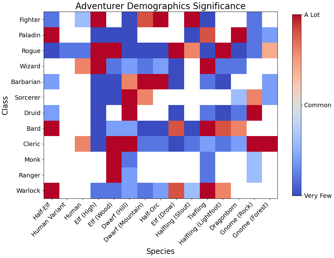
The simulator rolls attributes using the 4d6-drop-lowest method with two constraints: at least one score must be 16 or higher, and the average must be at least 12. Species, class, background, and alignment are then selected by weighted matching against the rolled array. Chi-squared residuals and correlation matrices reveal where the mechanics produce non-obvious outcomes.
A few things stood out. Strength and Dexterity are moderately negatively correlated — not because the game intends this, but because sequential generation and species bonus mechanics create it as an artifact. Intelligence is systematically underutilized as a primary class attribute. Gnomes and Tieflings are structurally disadvantaged: their species bonuses don’t align well with any physical class, leaving them clustered in a narrow band of options. Bard is the most mechanically unique class in the PHB; Fighter is the least. The adventuring population skews heavily Human and Elf, which turns out to be a direct consequence of their attribute flexibility rather than player preference for those species.
The image below shows chi-squared standardized residuals for species-class combinations — red means the pairing occurs more than the marginal distributions would predict, blue means less.
The code is on GitHub.
GeoGastronomy
I found myself at a wine tasting at Turnbull Winery in Napa. The server was describing how the position of a vine within the vineyard — its row, its elevation, its exposure — produces measurable variance in the grape and ultimately in the wine. I was fascinated. The question underneath it was familiar: how much does location explain outcome, and can you measure it precisely?
So I went home and started drawing polygons on Google Earth.
GrapeExpectations is a precision viticulture pipeline built around that question. The study area is a Washington State wine production region — 3,598 equal-area hexagonal cells at 1,000 m² each, covering nine years of Sentinel-2 satellite imagery, PRISM climate records, USGS topography, and gSSURGO soil data. The pipeline assembles those layers, engineers features from the DEM (slope, curvature, aspect, local relief), pulls spectral indices via Google Earth Engine, and stacks them into a multi-output ensemble: Random Forest, ExtraTrees, Gradient Boosting, XGBoost, and KNN feeding into an ElasticNet meta-learner. The target is weekly NDVI across the growing season — a proxy for vine canopy density and vigor. The stacked model hits R² = 0.967 on the held-out tune set. A companion analysis produces a frost risk raster by combining topographic position, elevation deviation, and NDVI history. I also reached out to Washington State University about the approach, and we explored deployment of Distributed Temperature Sensing fiber optic cables for direct canopy temperature measurement — the same photonic sensing technology I worked with at the UW Photonic Sensing Lab.
The vineyard work raised a version of the question I hadn’t expected: does this generalize? A vine in a particular microclimate is one data point in a larger pattern. What about coffee?
JavaScript (named for the Kona district, not the language) maps current and projected coffee suitability across Hawaiʻi’s Big Island — Kona and Kaʻu — at 500m resolution. The pipeline follows the same logic: hexagonal grid, terrain features from the DEM, ERA5-Land climate variables, Sentinel-2 NDVI composites, and SSURGO soil data, assembled into a labeled feature matrix from 674 coffee-farm polygons. A Random Forest classifier distinguishes coffee-farm cells from background; PCA extracts the environmental fingerprint of each district; k-means identifies microclimate zones within each region. The two districts turn out to be quite different — different thermal optima, different feature importance profiles, different climate variance explained. Forward projections using NEX-GDDP-CMIP6 (SSP2-4.5 and SSP5-8.5) extend the analysis to 2035 and 2045. Under projected warming, Kona’s thermal window contracts upslope. Kaʻu’s expands.
That result pointed somewhere bigger. If altitude and climate shape the chemistry of where coffee grows, do they shape the chemistry of the coffee itself? And if they do for coffee, do they do it for tea, for apples, for dairy?
TerraMetabolica is the attempt to answer that systematically. The framework is built around Region Sample Units — 65 RSUs spanning boreal Finland to the Himalayan plateau, each defined by climate, geology, altitude, and 4–6 native staple foods. Metabolite values are assembled from USDA FoodData Central and primary literature: organic acids, polyphenols, fatty acids, terpenes, umami compounds. The patterns that emerge are not subtle. Elevation shows consistent directional associations with protective metabolite concentrations across unrelated biological systems on multiple continents — chlorogenic acids in Arabica coffee, catechins in green tea, malic acid in apples, conjugated linoleic acid in grass-fed dairy. These are different crops, different synthesis pathways, different continents, pointing the same direction. Coconut lauric acid, genetically constrained, shows no altitude relationship across five RSUs — an intentional null that confirms the framework is discriminating rather than just inflating everything. The North American Prairie RSU has zero measured bioactive compounds across its staple foods. That absence is itself a finding.
The pipeline also runs in the other direction. Rather than asking what a location does to a crop’s chemistry, you can ask where a crop belongs — and whether you can answer that question without any labeled data at all.
KushCountry applies the same hexagonal grid architecture to outdoor cannabis in California’s Emerald Triangle with one structural constraint: the California Department of Cannabis Control withholds all spatial data for licensed cultivators. No training polygons exist. Terrain, climate, soil, and satellite canopy structure (Sentinel-2 NDVI) across 8,900 hexagonal cells are stacked, scaled, and handed to k-means without labels; the question is whether the resulting clusters self-organize around documented cultivation conditions. The answer is cluster 0: mean elevation 527m, growing degree days 1,395, vapor pressure deficit 1,568 Pa — mid-elevation interior, warm-dry Mediterranean conditions, the recognized Emerald Triangle cultivation profile. It covers 22.2% of the study area. Enforcement records from the Regional Water Quality Control Board confirm the archetype independently: cluster 0 is only 2.9% of Humboldt County terrain but 9.9% of documented violation parcels, a lift of 3.41. The archetype recovers at four of four agronomic criteria across K=4 through K=7; bootstrap cluster stability averages ARI=0.974 across 50 subsamples.
The framework — Unsupervised Terrain Fingerprinting — generalizes to any specialty crop where cultivation locations are suppressed, restricted, or absent.
The whole thing lives under one umbrella now: GeoGastronomy. The code is on GitHub.
Tidewater and lake-terminating glaciers are systematically thicker
Published in Journal of Glaciology, 2026
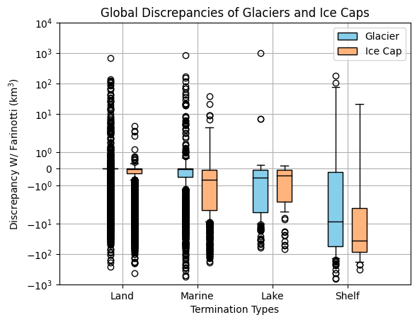
Tidewater and lake-terminating glaciers are systematically thicker than glaciers ending on land — and that difference accounts for roughly 20% of non-ice-sheet global glacier volume.
We arrived at this by training a shallow neural network on glacier-averaged thickness measurements from GlaThiDa and surface attributes from the Randolph Glacier Inventory (216,501 glaciers globally), then comparing models trained with and without water-terminating glaciers in the training set. The gap between those models is the imprint of ice-ocean interaction on global ice volume. It is consistent with a simple mechanical explanation: water pressure at the ice front permits thicker termini than are stable in air, setting a different boundary condition for equilibrium glacier geometry.
The pipeline handles the messy reality of co-registering two independently maintained global datasets across different measurement epochs, using distance and area thresholds to filter unreliable matches. Leave-one-out cross-validation across 273 co-registered glaciers produces per-glacier uncertainty estimates that propagate through to a global volume uncertainty budget.
Seismic Ringing
In November 2022, a fiber optic cable running under Red Square on the University of Washington Seattle campus picked up something nobody had asked for.
The UW Photonic Sensing Lab operates a distributed acoustic sensing array: a fiber optic cable connecting UW Seattle to UW Bothell, running the length of the city and sampling ground motion across thousands of channels at roughly 6 meter spacing. We were searching for signals from trains moving through underground tunnels to audit their schedule. While scanning repeating 10-minute windows of data, we found instead a series of high-amplitude, low-frequency events centered under Red Square between the evening of November 10 and the afternoon of November 14, 2022.
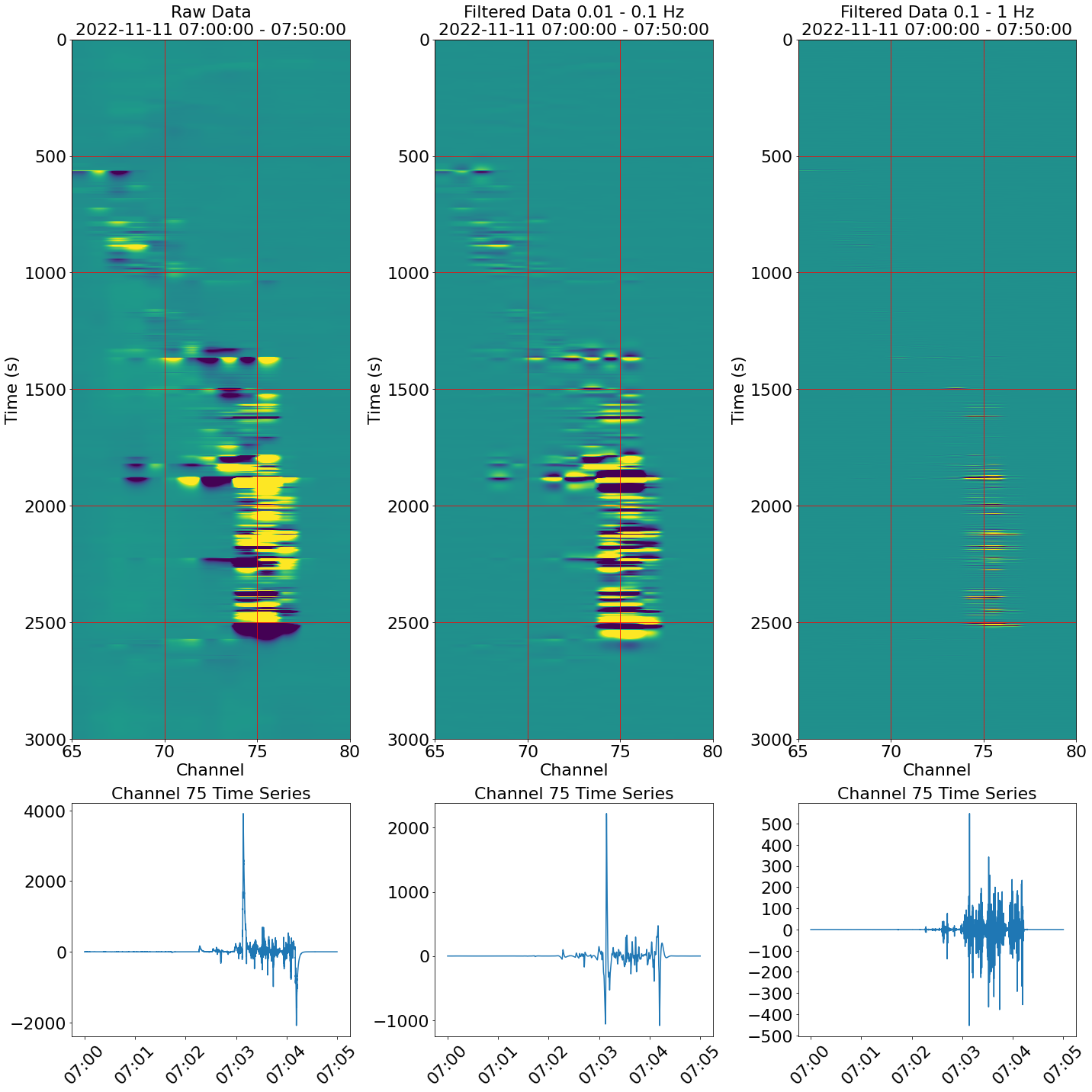
It is currently unknown what is causing these signals as they span several channels of approximately 6 meter spacing per channel and do not always have similar features. An early hypothesis suggested these could be percussive signals from a nearby marching band or similar performance, however the events occur throughout the day and are non-dispersive. A percussive signal should be detected farther along the cable and be dispersive, however these detected signals are confined to only a few channels.
These signals are also accompanied by long “ring-down” time after detecting extremely large amplitudes as if the cable were kicked or picked up. There are also periods of extended shaking of several minutes as if a jackhammer is being operated right next to the cable. A likely candidate for these signals could easily be construction or maintenance in the parking garage below Red Square.
Two steps would narrow it down: a tap test in or under Red Square to precisely locate the cable within the structure, and a review of facilities maintenance records for the parking garage during those dates.
When large amplitudes were detected, the data was passed through two bandpass filters (0.01–0.1 Hz and 0.1–1 Hz) and plotted as a space-time heatmap. Selecting a single channel then revealed the ring-down in the time series — signals persisting for over a minute after the initial event.
Pyopoly
Monopoly has always been a fun way to kill time. First as a child playing star wars monopoly with my family, then later I made a board and dice from paper to play with fellow recruits in basic training. While on paternity leave I began writing a python based command line interface version of monopoly.
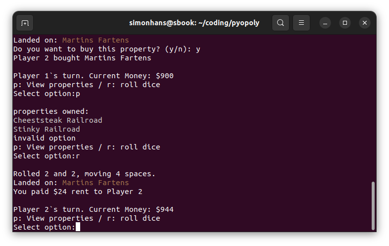
The board and properties are defined as classes, with NumPy for dice. The full mechanics are implemented: buying properties, building houses and hotels, paying rent, drawing Chance and Community Chest cards, going to jail. CPU opponents make automated buy and build decisions. The terminal output is colorized. It ends when someone goes bankrupt — unlike our current housing market, which does not.
The code is on GitHub.